
Atmo
Building a Premium Visual Language for an Event Brand
Project Objective:
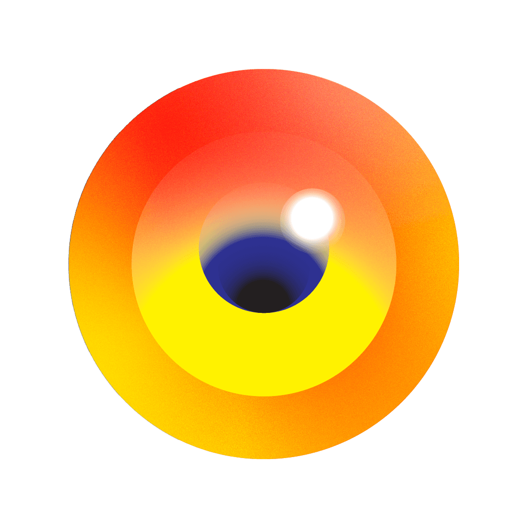
Atmo required a visual direction that could capture the energy of music, movement, and live experiences while remaining flexible across a wide range of applications. The goal was to develop a series of abstract illustrations built around gradients, motion, and soft transitions, creating a visual system that felt contemporary, immersive, and instantly recognizable.
Beyond creating standalone visuals, the concept needed to scale across festival touchpoints, from wristbands and flags to packaging and promotional materials. The challenge was to balance artistic expression with practical versatility, ensuring the brand maintained a cohesive presence in both digital and physical environments.
The final direction positioned Atmo with a premium visual identity, helping it stand apart within the highly competitive festival and events landscape.


